To Be Nuts About Someone_ To be madly enthusiastic, infatuated with. 'You know, don't you, that he is nuts about you.'
The start of my research has led me to Joseph Blay Ord and his 'Still life with vase fruit and nuts' oil painting. Its nice that he has give the nuts a context (with fruit).
http://www.saleoilpaintings.com/paintings/joseph-biays-ord/joseph-biays-ord-still-life-with-vase-fruit-and-nuts.html
Robert Seldon Duncanson Still life with fruit and nuts is a similar oil painting worth noting.
http://commons.wikimedia.org/wiki/File:Robert_Seldon_Duncanson_-_Still_Life_with_Fruit_and_Nuts_-_Google_Art_Project.jpg
So far its been very organic and fruity, but here is Margot Dinardi and her 'Nuts in shell' Oil Painting which seems a bit more resilient basic which is a nice break.
http://www.artistrising.com/products/315115/Nuts.htm
Liliya Shalpak illustrations host an array of nutty goodness here in the 'Nut Set'. This is a nice look at detailed nut types and the variety i have to choose from... incidentally i would never have thought to crack open a peanut from its shell and draw it that way...
http://www.123rf.com/photo_11838111_vector-art-illustration-which-represents-the-various-kinds-of-nuts.html
I thought id look at animals associated with nuts and obviously a squirrel is the main creature here. Again, like the fruit, it gives a context to the subject, but can also take away from the topic too.
http://ofcabbagesandkings.co.uk/nuts-about-you-a4-print/
Snowdon Design & Craft screen print also shows a squirrel and a very detailed print design too. Not the style i am thinking about.
http://www.notonthehighstreet.com/snowdondesignandcraft/product/nuts-about-you-print
Ivette is the only name given when associated with this nut design created using Copic Markers. Its simple but perhaps a bit too cartoon like for my taste in this subject. Still, another take worth looking at, and its interesting to note that again its an acorn thats being used as a nut. I think id like something a bit more adventurous.
http://www.tradefishdesigns.com/2011_09_01_archive.html
This beautiful print is great, its definitely a style i would take on and into consideration for producing work in. But i think im after more of a literal nut theme, not featuring a squirrel.
http://www.thebrokeassbride.com/2010/09/wedding-inspiration-nuts-about-you/
These Paper Creations by Mindy are far too cartoon for my liking, but hold a level of text that explains the theme/idiom in a way that i need to some how. I think i will stick with the hand stamper for the text to completely stick to continuity with the AD32 card project of mine.
http://papercreationsbymindyblog.blogspot.co.uk/2012/01/nuts-about-you.html
Possibly printed, possibly laser cut this card, its hard to tell and again features acorns. Not something i wish to do because everyone else is...
http://lindsayamrhein.blogspot.co.uk/2010_07_01_archive.html
This interesting looking low relief handmade card has drawn me in, however its not tat tasteful to me and doesn't feature another type of nuts... very stereotypical.
http://refinedfocus.com/jedisergei/?paged=2
'Elephant with Heart and Peanuts'. Its nice to see another animal other than a squirrel! A very contemporary looking card.
http://www.violetcottage.com/valentine-s-day-love-anniversary/261-nuts-about-you-blank-inside-elephant-with-heart-peanuts.html
Ashley Boatman has created a well rounded card that ties together, but its not a style im looking to pursue, and again features a squirrel!
http://ashleyboatman.blogspot.co.uk/
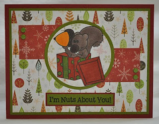
This very old school looking printed card produced by Artist Donna is interesting with its background styles and particularly colour palette which makes it feel like Christmas and yet isnt related what so ever to the same theme...
http://datsmystyledj.blogspot.co.uk/2011/01/im-nuts-about-you.html
Kim Gelser here has illustrated a dull pair of nuts floating on what i can only assume is a card... The drawings are simple and cleverly basic however, but i think i will avoid the peanut shells.
http://www.etsy.com/listing/35509438/im-nuts-about-you-card
Holley Barnhart has created a valentines card that does not appeal, but is very clever in terms of creation styles incorporating the use of the laser cutter of stamp cutter giving it an almost 3D edge.
http://holleybarnhartsblog.blogspot.co.uk/2012/01/im-nuts-about-you.html
Another valentines card with some sort of cartoon drawings mixed with still life. this doesn't work and i have now learnt from seeing this that the process this person has used is definitely one to avoid.
http://www.redbubble.com/people/ann12art/works/9594708-im-nuts-about-you?p=greeting-card
Intended as a valentine card this is a very tacky looking take on the idiom and one to avoid the style of all together.
http://www.zazzle.co.uk/nuts_about_you_t_shirts_and_gifts_custom_invites-161902876948576240
Again, Intended as a valentine card this is a very tacky looking take on the idiom and one to avoid the style of all together.
http://www.somethinggreenweddings.com/products/im-nuts-about-you
Kerri has designed these lovely little packets of nuts purely looking like they can only be used on valentines day. thats something that i would not like t tie my cards down too, that one day they can only be used is not for me. I want something thats a bit more open...
http://www.shakentogetherlife.com/2013/01/i-am-nuts-about-you-circus-peanuts.html
This Wue necklace is an interesting take on product design and the idiom.
http://www.notonthehighstreet.com/wue/product/nuts-about-you-necklace
Nut and Bolt art went through a popular stage a year ago or so, but it'd be good to include a nut of this kind to tie in my work as i think that once i have an outcome in my desired style, nuts maybe unrecognizable without this...
http://egyphoto.blogspot.co.uk/2009/01/nuts-and-bolts-art06.html
Images of my observational drawing set up from nuts of all kinds...
Please see sketchbooks for development work, but here are my outcomes ready to go into the card template...
Having collected and finalised my imagery here is the card below in the template i hope to continue with. I have chosen to do this because of the success the last range had with peers and tutors, thus not wanting to deviate too far. Note that the text is in the same fashion as the previous card range, adding continuity:

Here is the front and inside of the envelope developed and adapted from the previous card range project. I have changed the imagery to suit and complement this particular card. I am sticking with this design because it works most effectively and was a success previously.


No comments:
Post a Comment