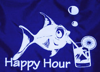
Drink Like A Fish_ To be a hard drinker, a habitual, excessive drinker.
Phillip Myatt has illustrated this idiom in a literal sense, again something i would not like to pursue because it comes across tacky and distasteful on a card range...
http://phillmyatt.blogspot.co.uk/
Christian Alexander has created a more tasteful take on the subject, but again, a bit too predictive.
http://christianalexanderart.blogspot.co.uk/2011/07/drink-like-fish.html
Perfect together, these idioms really do sum themsleves up well, but i cant help but think that this idiom has been obviously overdone in the same fashion...
http://earthscore.deviantart.com/art/Smoke-like-a-chimney-drink-like-a-fish-271835725
This sketch is very cool, and clever. Unfortunately i can only relate to it becaus of the pencil involved in the creation, as this is what i will be using....
http://3bananas4u.blogspot.co.uk/2009/12/drink-like-fish.html
Nate Van Dyke's take on the theme is a little graffiti like, and works well, but not for me, although the shape of the fish shouts simplicity...
http://www.etsy.com/listing/114594534/nate-van-dyke-art-sticker-drink-like-a
This typography experiment is very clever and interesting. Its basic, especially in terms of imagery, but tahts what im looking for in a way, so this fits the bill almost.
http://quiindesign.com/typograph/
Ideal! Relating to the fish side of the idiom i have been recommended to look at James Joyce's work in Varoom purely because its a fish. I like this simplicity. I would need something a little more realistic however, but this is a good reference.
http://www.jamesjoyce.co.uk/
More of a traditional illustration. Its clear that i will be using a fish, but purely a fish, no drink!
http://yourtruthdiet.wordpress.com/2013/04/09/insanity-week-2-throwdown/
A cleverer use of the idiom, but an interesting mix of imagery...
http://www.thefishgallery.com/index.cfm/ac/Events/ID/1715
It doesn't get any better...
http://pereplet-knig-restavracija-knig.prv.pl/drink-like-a-fish-picture.php
I dont think we can escape the literal tackiness that surrounds this idiom... Which is a good thing because my work will stand out!
http://kellynguyen67.wordpress.com/category/uncategorized/page/2/

Having collected and finalised my imagery here is the card below in the template i hope to continue with. I have chosen to do this because of the success the last range had with peers and tutors, thus not wanting to deviate too far. Note that the text is in the same fashion as the previous card range, adding continuity:
Here is the front and inside of the envelope developed and adapted from the previous card range project. I have changed the imagery to suit and complement this particular card. I am sticking with this design because it works most effectively and was a success previously.


No comments:
Post a Comment