All Shipshape_ Everything in good order, all neat and clean. 'The rooms are all shipshape for our guests.' The phrase was originally 'all shipshape and Bristol fashion', meaning that the ship was properly prepared before sea. The port of Bristol was well known for its efficiency for preparing ships for sea.
Ruby Lane is a site that sells antiques and artwork and it so happened that this masterpiece was being featured. Its extremely detailed and perhaps quite a big ask for this project, plus i think that if i were to produce something similar it would not tie in with the rest of the series of card ideas...
http://www.rubylane.com/item/167844-11195/Marshall-Johnson-Nearing-Port-Calendar
A more simple and modern version of the ship, but painted on a wall... again, i think i will be needing a smaller part of the ship to sum up the idiom.
http://joyreactor.com/post/623670
This is a very handy website based on drawing ships and the parts of which will come in useful no doubt.
http://www.wetcanvas.com/ArtSchool/Drawing/DrawingShips/Lesson1/
If i were to simplify the ship i think the outcome would be like this. It looks like it belongs in a children's colouring book.
http://classyartwork.com/images/Illos/battle_ship_art.gif
Ah, the ships helm would make for a great conclusion to this idiom, definitely reconisable and relates directly to the idiom...
http://www.craftsmanspace.com/free-projects/ship-wheel-plan.html
Is the anchor too cliche?... I think so.
http://weheartit.com/entry/10219662?group=A&imgres=anchor+drawing
I was thinking about looking at the rigging as this is an important and recognisable part of anything ship related as Patricia Tucker explains through her art work:
http://eacartawards.org.uk/picture-2177riggingonthevictory.aspx
Joseph Mallord William turner' has finely drawn out the details of Rigging within his sketch book. inspiring!
http://www.tate.org.uk/art/artworks/turner-details-of-rigging-d17436
Perhaps this shutterstock canon illustration would be a suitable theme for the idiom. All will be explored within the sketchbooks...
http://www.shutterstock.com/pic.mhtml?id=101663434
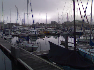
Photographs of items and places that have been reference points for me:
Having collected and finalised my imagery here is the card below in the template i hope to continue with. I have chosen to do this because of the success the last range had with peers and tutors, thus not wanting to deviate too far. Note that the text is in the same fashion as the previous card range, adding continuity:
Here is the front and inside of the envelope developed and adapted from the previous card range project. I have changed the imagery to suit and complement this particular card. I am sticking with this design because it works most effectively and was a success previously.


No comments:
Post a Comment