To Hang Up One's Boots_ To retire. 'I'll be hanging up my boots next year. I think i deserve a rest after running the business for thirty years.' The allusion is to the football player who hangs up his boots after every match.
Donna Van Cleve kicks off my boot related research with these very tidy illustrations. Great angles. very inspiring to look at.
http://blog.donnavancleve.com/
Next is a very acuaret and light water colour painting by Cathy Holtom found here at
http://cathyholtomdustylane.blogspot.co.uk/2011/01/dusty.html . Again, another great angle to have produced this work from really capturing the boot. Its also worth noting that the boot design is super simple too!
Sarah has mustered up this creation of a simple boot and worked into it using various materials. This angle is complementary and something i have taken on board.
http://www.bbc.co.uk/blast/art_design/my_boot_drawing/117760
This cowboy boot illustration is interesting, although not entirely accurate, but the option of a cowboy boot is there for me to draw...
http://www.shutterstock.com/pic-37578394/stock-photo-cowboy-boot-illustration.html
Kathryn Elyse has produced these very nice looking boots. A very clean and well finished set here, something that i am not aiming to produce, but i couldn't resist these.
http://paperfashion.net/tag/boot-illustration/
A simple fashion illustration sketch featuring the side on view, a bit basic for my ideas, but again, worth a mention.
http://www.lashoegirl.com/boot-sketches-2/
A stock illustration of a work boot, more of the style of boot i am looking to go for...
http://www.istockphoto.com/stock-illustration-13721620-sketch-of-a-work-boot.php
This is an interesting find, a boot created using a Gradient Mesh Tool Illustrator! Way out of my reach.
http://www.cgshelf.com/graphics/tag/illustrator-tutorial/
Good Werks have created this Harebrained Fabric Illustration... Something i could pursue, but out of my league for this project. Stick to what i know.
http://goodwerks.wordpress.com/tag/cowboy-boot-illustration/
A simple Vector Illustration, definitely more of the angle i am looking at here, again i like it because of its simplicity.
http://www.masterfile.com/stock-photography/image/400-05245847/Vector-illustration-tattoo-style-oldr-ugged-boots.
Sketch Illustration have created this wonderful piece featuring cowboy boots. I don't think that i will pursue cowboy boots, i am planning instead to go for the work boot as it feels a bit more in-keeping with the idiom. Interesting though that this piece has the context of the hat as well.
http://www.mediafocus.com/stock-photo-cowboy-boots-western-hat-sketch-illustration-tk123603.html
Another vector Boot in a much simpler fashion, however probably closer to what my outcome will look like...
http://www.featurepics.com/online/Vector-Boot-1770674.aspx
Below are my photographs of the observational drawing process found in the sketchbooks.
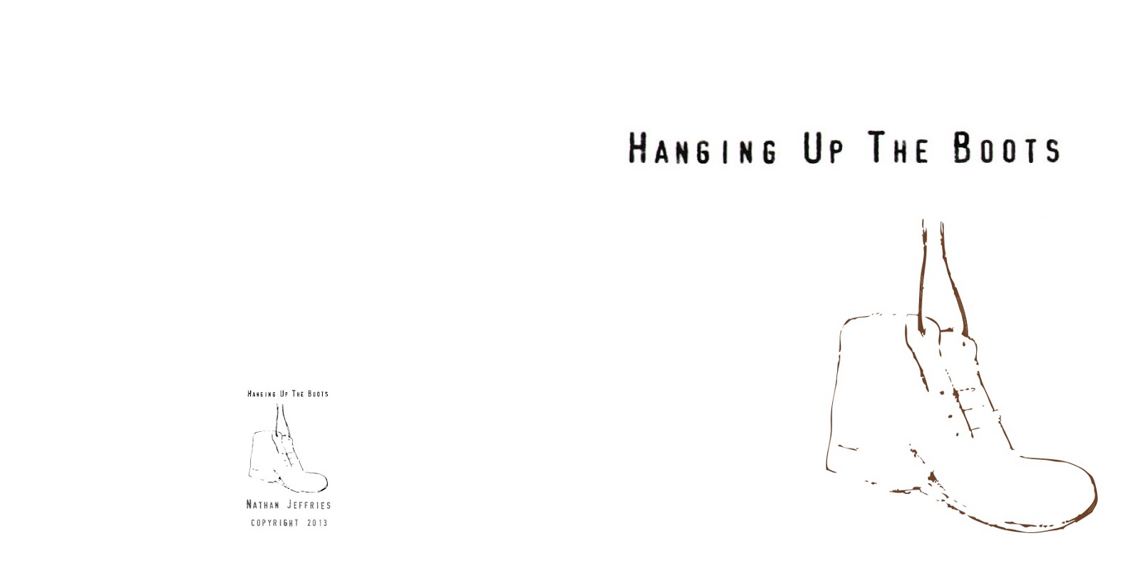
Having collected and finalised my imagery here is the card below in the template i hope to continue with. I have chosen to do this because of the success the last range had with peers and tutors, thus not wanting to deviate too far. Note that the text is in the same fashion as the previous card range, adding continuity:
Here is the front and inside of the envelope developed and adapted from the previous card range project. I have changed the imagery to suit and complement this particular card. I am sticking with this design because it works most effectively and was a success previously.