Sunday, 26 May 2013

Conclusive Statement


Over all, this project has worked out well in terms of outcomes and productivity. I am glad to be able to look upon what I have produced and be proud of it. Having worked with a form of greeting card before I definitely think that this was a good path to go down and as a result I feel that I have built upon my previous work helping establish myself as a creator. I have pushed forwards using a new topic and quantity, of which I am pleased with both. However, I am still unaware of my strengths in this field, but like the previous project I feel that I have come away with a deeper set of skill and subject knowledge.
I still very much enjoy producing handmade work and think that this is a niche I am gaining a firmer grip on; the use of the hand stamper and the attention to detail that I can include within my work both excite me.

Throughout this project I have kept a steady eye on the time and have therefore triumphed with my time management! This is encouraging for me and has helped boost productivity on my part. Once more I have also found it helpful to keep track of my research and final outcomes using a blog, as a result complementing my sketchbooks nicely.
However, I would say that my weakness in this project has been, once more, not being able to knuckle down to a specific title for the project for some time, however, this is potentially a positive thing because of the time I have been able to spend easing myself into this.

I am pleased to a point with my final outcomes, I don’t think that they are overly exciting to look at, but I need to remember that I won’t always be producing work for myself, and I suppose that this is good way of looking at it, that sometimes what a client wants is just not fully your cup of tea. But perhaps I need to learn how to inject a little of my personality into the work. These are, after all, minimal hand made note/correspondence cards that get straight to the point, and I think that they do this effectively. Just like the Wish You Were Here cards I think that they stand out and at the same time blend in with the current market; what will set them apart is their theme, which is communicating to an audience a widely unknown ‘card’ topic.

With this work I not only plan on selling the cards at the summer show and in local hand made shops such as No Guts No Glory, I also hope to approach farm shops around the local area of where I am moving too. The nature of farm shops can be very handmade based and as a result my work should fit right in. I plan on keeping the card templates and thinking about new themes relating to where I will be living; rural life, animals, farms, etc.

To develop this project further I would include the title of the over all topic on the rear of the cards instead of the card title, for example, I would place ‘English Idioms’ instead of ‘She’s a Peach’, as this would encompass the card as part of a wider set. I would also think about perhaps stamping the inside with what that particular idiom means, so the description would read in the middle. Although this may take away the broadness of the card topic. 

Outcomes


Here are my outcomes for this project. Please note that i have taken further images to express how well these cards can look, but  don't think that its right to put ALL 60 images on this post. I don't think you'd enjoy the load time. Instead i have included one image of each as well as all together:


Friday, 24 May 2013

Colour Experiments


I have taken to producing a few colour experiments that i've had in the back of my mind. I have had the curiosity of producing these cards using colour to outline the image. The colour would of course reflect the image and theme of the card, for example, Out To Grass = Green, etc.


I think that although they bring a new lease of life to the cards, i don't think that it's the right direction. It's not quite fulfilling of the over all look and feel. These are, in a way, meant to reflect my previous Wish You Were Here card project, with the black lines and simplicity that they brought about. I don't feel that by adding colour in this way adds to the overall item, therefore i shall revert back to black lines.

Tuesday, 30 April 2013

Fighting Fit


Fighting Fit_ In excellent physical condition. 'Andrew is fighting fit and ready to start work again.' This phrase derives from cock-fighting.


Relating to the idiom's origins, i however don't think people will immediately understand this if i were to do it...

http://www.etsy.com/listing/93424696/digital-image-vintage-art-illustration


Here is a stock image of a physically fit bloke flexing his muscles. Perhaps a more active take of the idiom?

http://www.stock-images-illustrations.com/enlarged/645-01538452/Weight-lifter-flexing-his-upper-body-muscles/3


A form of martial art or boxing would work well just like this illustration... Id have to pick out the obvious give away though as to what sport it is, and a martial art would be tough.

http://www.123rf.com/photo_9168559_fighters-trio.html


An editorial illustration for the guardian... Fighting Fit indeed.

http://www.guardian.co.uk/lifeandstyle/series/get-fit-for-free


I think its safe to say that a boxing theme would suit this idiom best in my opinion and Derek Russell's work of Muhammad Ali certainly does the job.

http://inspirevibrance.com/photo/muhammad-ali


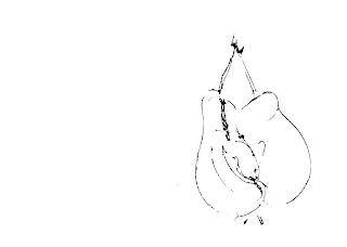
This is it, ideal for what im after, the gloves that will sum up the theme with the idiom with no problem... To the sketchbook!

http://casualist.wordpress.com/author/casualist/page/17/


Having collected and finalised my imagery here is the card below in the template i hope to continue with. I have chosen to do this because of the success the last range had with peers and tutors, thus not wanting to deviate too far. Note that the text is in the same fashion as the previous card range, adding continuity:


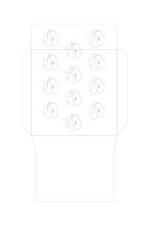
Here is the front and inside of the envelope developed and adapted from the previous card range project. I have changed the imagery to suit and complement this particular card. I am sticking with this design because it works most effectively and was a success previously.


Drink Like A Fish


Drink Like A Fish_ To be a hard drinker, a habitual, excessive drinker. 


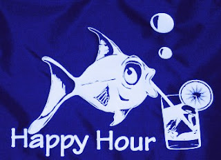
Phillip Myatt has illustrated this idiom in a literal sense, again something i would not like to pursue because it comes across tacky and distasteful on a card range...

http://phillmyatt.blogspot.co.uk/


Christian Alexander has created a more tasteful take on the subject, but again, a bit too predictive.

http://christianalexanderart.blogspot.co.uk/2011/07/drink-like-fish.html


Perfect together, these idioms really do sum themsleves up well, but i cant help but think that this idiom has been obviously overdone in the same fashion...

http://earthscore.deviantart.com/art/Smoke-like-a-chimney-drink-like-a-fish-271835725


This sketch is very cool, and clever. Unfortunately i can only relate to it becaus of the pencil involved in the creation, as this is what i will be using....

http://3bananas4u.blogspot.co.uk/2009/12/drink-like-fish.html


Nate Van Dyke's take on the theme is a little graffiti like, and works well, but not for me, although the shape of the fish shouts simplicity...

http://www.etsy.com/listing/114594534/nate-van-dyke-art-sticker-drink-like-a


This typography experiment is very clever and interesting. Its basic, especially in terms of imagery, but tahts what im looking for in a way, so this fits the bill almost.

http://quiindesign.com/typograph/


Ideal! Relating to the fish side of the idiom i have been recommended to look at James Joyce's work in Varoom purely because its a fish. I like this simplicity. I would need something a little more realistic however, but this is a good reference.

http://www.jamesjoyce.co.uk/


More of a traditional illustration. Its clear that i will be using a fish, but purely a fish, no drink!

http://yourtruthdiet.wordpress.com/2013/04/09/insanity-week-2-throwdown/


A cleverer use of the idiom, but an interesting mix of imagery...

http://www.thefishgallery.com/index.cfm/ac/Events/ID/1715


It doesn't get any better...

http://pereplet-knig-restavracija-knig.prv.pl/drink-like-a-fish-picture.php


I dont think we can escape the literal tackiness that surrounds this idiom... Which is a good thing because my work will stand out!

http://kellynguyen67.wordpress.com/category/uncategorized/page/2/


Having collected and finalised my imagery here is the card below in the template i hope to continue with. I have chosen to do this because of the success the last range had with peers and tutors, thus not wanting to deviate too far. Note that the text is in the same fashion as the previous card range, adding continuity:


Here is the front and inside of the envelope developed and adapted from the previous card range project. I have changed the imagery to suit and complement this particular card. I am sticking with this design because it works most effectively and was a success previously.